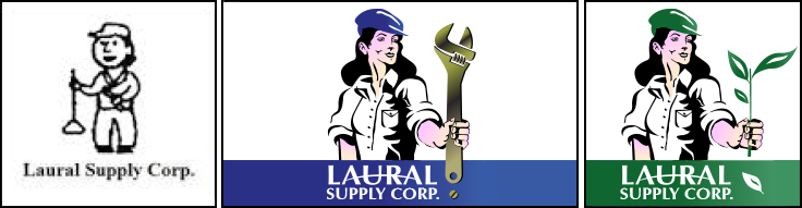
Laural Supply: Branding a Woman-owned business
The previous gender-neutral cartoon character was eliminated in favor of a strong, confident woman. Easy-to-read wordmark combined with new character. Wrench (as exclamation mark!) replaced plunger to further promote strength. Blue and gold color palette added to black for impact, and extension to web and collateral graphics. With growing importance on eco-friendly products that use less water and energy, I gave the new character a green makeover.
|
 |
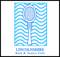 |  |  |
The Lincolnshire Club: Revitalized tennis courts, workout facilities... and logo
I created an upscale image for a growing, multi-faceted athletic club. The monumental "L" acts as a workout treadmill as well as a victory platform. Hand-lettered "Lincolnshire" connotes exclusivity as a personalized "autograph". Human form is both male and female: gender is in the eye of the beholder.
|
|
 | |  |
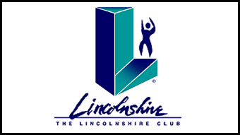
The Kalva Corporation: I scream, you scream, we all scream for ice cream!
Because this ice cream coatings company logo had equity in the marketplace since its inception in 1935, I retained the essential logo elements while condensing them into a more unified unit By eliminating the superfluous white space around the letterforms, the new wordmark can now appear larger in smaller applications (business cards and packaging)!
|
|
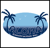 | | 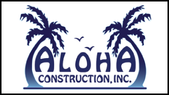 |
Aloha Construction, Inc.
This roofing contractor had a lot of personality; and started the company with a fun name and brand identity to help take the sting out of homeowners having to invest (sometimes unexpected) dollars into their roofs. I retained the essential elements of the logo, and made it more emblematic, rather than illustrative. I removed the restrictive blue-gradation oval to enhance legibility of the main word: "Aloha", and bowed the shape of the palm trees to reflect the curves of the "A's". I enlarged the text for "Construction, Inc." to improve legibility, then enlarged the two birds and had them fly closer to the letterforms.
|
|
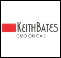 | | 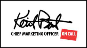 |
Keith Bates - CMO.
A flood of data, devices, social-media and media channels, paired with their own worries have many CMOs swamped, accoding to AdAge Magazine. Though they recognize that changes are coming, many admit they and their organizations are not prepared. Enter Keith Bates, CMO on Call. The concept was great, but needed to be tweaked. Since Keith Bates is his brand, I replaced the dated typography with his signature, and spelled out "Chief Marketing Officer" to make sure it is understood by all who see it. I put my own twist on the red box; and put it to work as a background highlight for "On Call".
|
|
 | |  |
AquaHealth: Healthy is now sustainable
Aquahealth realized that their product line was perfectly suited for the growing green marketplace and sought to invest its identity with a tagline that is Earth friendly. Letterforms are strengthened with a dropshadow, and set against a patterned background.
|
|
 | |  |
Northwestern University: Masters of their own identity
Intertwined stylized DNA strand and wordmark to announce the university's new masters program. Color palette adheres toNorthwestern University's strict design rules.
|
|
 | |  |
Care in the Home: Health Services with a Heart
Several equity elements were combined into a cohesive single unit that is easily placed on business cards, collaterals, signage and vehicles. The important word, "care", was enlarged for emphasis "in the home" phrase was placed on a single line and logically brought within the outlined home shape "Health Services" now shares the same typeface as other words.
|
|
 | |  |
Matthews Employment: This North Shore company has provided a bridge between employers and job-seekers since 1969. With an evolving workplace, their old-fashioned logo began to feel outdated. Because the logo had recognition in the marketplace, I adjusted the letterforms by adding some curves to soften and humanize the company. I raised the crossbars on the "A", "E" and "S" to prevent them from filling in when printed in small applications. I also added a metallic shading to the horizontal bars, plus a light dropshadow to give life - to help it pop off the page (and screen).
|
|
 | |  |
Shaars International: The client purchased a very attractive logo from one of those impersonal online Web sites. Once I was hired to design the Web site, I commented that, while we could use the logo, it would make more sense to showcase a cargo ship. The president of the company, also a Naval Captain, agreed, and we created a colorful logo that shows exactly what the company does: import and export large cargoes.
|
|
 | | 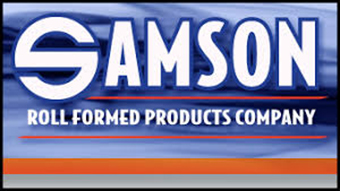 |
Samson Roll Formed Products Company: This American branded-company had a great start with its distinctive "S" - stronng enough for Superman's chest. Unfortunately, the remaining letterforms were too small in proportion, and weakened the readability of the (otherwise strong) name: SAMSON. I reworked - and enlarged - the letterforms, then increased the size of the description line for legibility - especially at smaller sizes. Finally, the line which read: "A Division of Block Steel Corporation" was removed in favor of strengthening the Samson name.
|
|
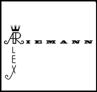 | | 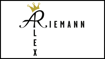 |
Alex Reimann: This Social Media expert wanted to develop his own brand for personal use. While he had access to computer tools, he asked for assistance to refine his basic concept, including a more elegant ligature of his initials, and a complimentary typeface.
|


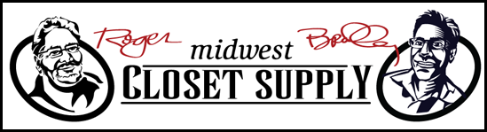
Midwest Closet Supply: This company, run by two brothers lacked an online personality. I crafted a couple of good ol' fashioned caricatures, and combined them with matching signatures to brand their business with the personal touch.
|
|
 | | 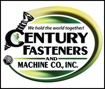 |
Century Fasteners & Machine Co., Inc.: This 55-year old company was in danger of becoming an anachronism in today's global marketplace. Now in its second generation, the woman-owned company needed to reassert its brand. I added color and a tagline, in addition to a globe to indicate the international reach to customers in need of specialty fasteners.
|
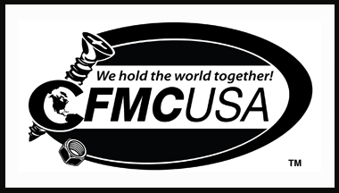
Evolution of the Evolution! Century Fasteners continued to have conflicts with a similar company who purchased the singular version of the name: Century Fastener (without the "s". In order to build the brand into the future, the initials: CFMCUSA were adopted to streamline the URL and EMAIL addresses.
|
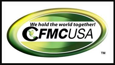
A new twist. Century Fasteners began manufacturing products with plastics and non-metal composites that did not require screws, bolts or fasteners. Wanting to extend the growing brand architecture, we omitted the screw and washer icons and completed the oval. We retained the color scheme and fonts for consistency.
|
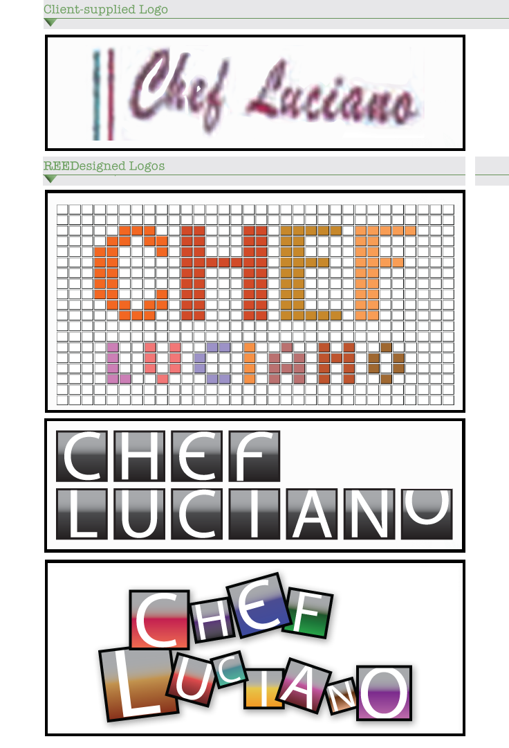
Chef Luciano's This Chicago South Loop restaurant gem had a variety of logos that developed as the Chef/Owner continued growing from storefront to storefront. When the City of Chicago declared the corner portion of the building a Landmark, an architectural project was put into place to revitalize the structure. The first concept I presented showcased the white tile-base of the original White Castle building. Then, I chose bright colors from the Chef's menu to spell out the restaurant name. Based on a square grid, this solution scales up and down quite nicely. Because the restaurant is located in Chicago's historic Motor Row District, I had fun with an odometer approach to the logo as Chef Luciano rolls his new restaurant into place. The third logo is a mashup of the first two; and captures the chef's eclectic personality, and his use of spices from around the world.
|